高清屏一像素边框问题


发现问题

在 iPhone 设备(Retina屏)上一像素边框设置有问题

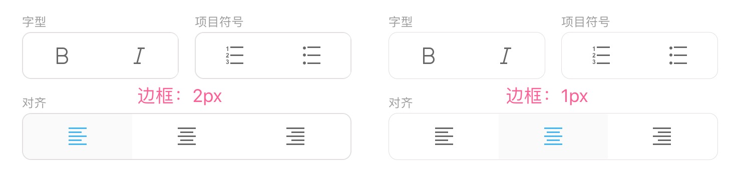
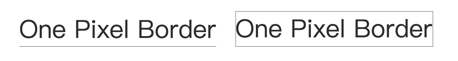
如上图右所示,UI 要求效果的边框是 1px;如上图左所示,开发出来的效果边框为 2px(膜拜一下UI的像素眼 👍🏿)。设置边框的代码很简单,如下:

1
border: 1px solid #e1e0e0;

那问题该如何解决呢 🤔

基本概念(术语)

device pixel / physical pixel

设备像素(或物理像素)是显示屏中最小的物理单元。 每个像素点根据操作系统的指示设置自己的颜色和亮度。

density-independent pixel(DIP)

设备无关像素(也叫密度无关像素),可以认为是计算机坐标系统中得一个点,这个点代表一个可以由程序使用的虚拟像素,然后由相关系统转换为物理像素。

CSS pixel

CSS 像素是浏览器使用的抽象单元,用于精确地,一致地在网页上绘制内容。 通常,CSS 像素被称为与设备无关的像素(DIP)

devicePixelRatio

设备像素和设备无关像素之间存在着一定的对应关系,这就是 devicePixelRatio(设备像素比)

devicePixelRatio is the ratio between physical pixels and device-independent pixels (dips) on the device.

devicePixelRatio = device pixels / dips

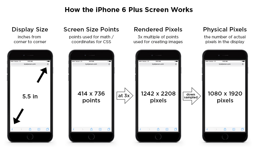
devicePixelRatio 值为 1 的屏幕称之为标准屏;目前,大部分移动设备都是高清屏,即 devicePixelRatio 值大于 1 的屏幕,对于苹果设备来说,我们经常听到 Retina 视网膜屏,其中 iPhone6/6s/7 的 devicePixelRatio 值为 2;而 iPhone6 plus/6s plus/7 plus 的 devicePixelRatio 值为 3。

通过一个例子进一步理解其中的关系:

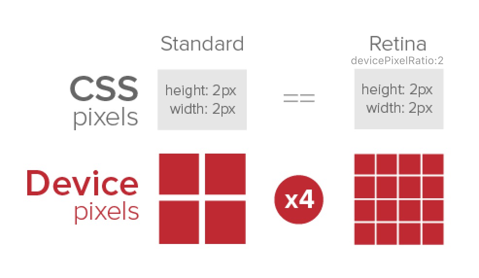
假设我们需要绘制如下这个 div 节点,

1
<div height="2" width="2"></div>

  • div 节点宽度和高度都是 2px,这里的 2px 指的就是 CSS pixel,而 CSS pixel 是抽象的单位,所以不管在标准屏,还是高清屏,其 CSS pixel 都是 2px
  • 1 CSS pixel 等同于 1 DIP
  • device pixels = devicePixelRatio * dips
    • 在标准屏(devicePixelRatio 值为 1)中绘制这个节点时,节点的设备像素为 2px * 2px
    • 在高清屏(devicePixelRatio 值为 2)中绘制这个节点时,节点的设备像素为 4px * 4px
  • 高清屏中节点的面积是标准屏中的 4 倍

在网页中,我们可以通过 JS 获取 devicePixelRatio

1
console.log(window.devicePixelRatio)

在 CSS 媒体查询(media query)中也可以用到 devicePixelRatio

1
2
3
4
@media only screen and (-webkit-min-device-pixel-ratio: 2),
@media only screen and (min-device-pixel-ratio: 2) {
/* TODO ... */
}

解决一像素边框问题

分析问题

了解了以上这些基本概念,我就知道设置边框一像素 border: 1px solid #e1e0e0; ,在高清屏中展示大于一像素的原因了,因为 devicePixelRatio 这个家伙导致的,由此我们会快就写出如下解决方案:

1
2
3
4
5
6
7
8
9
10
11
12
13
14
15
div {
border: 1px solid #e1e0e0;
}
@media only screen and (-webkit-min-device-pixel-ratio: 2),
@media only screen and (min-device-pixel-ratio: 2) {
div {
border: 0.5px solid #e1e0e0;
}
}
@media only screen and (-webkit-min-device-pixel-ratio: 3),
@media only screen and (min-device-pixel-ratio: 3) {
div {
border: 0.3333px solid #e1e0e0;
}
}

devicePixelRatio 为 2 的时候,设置边框为 0.5px;在 devicePixelRatio 为 2 的时候,设置边框为 0.3333px。但是要注意有些 Retina 屏的浏览器可能不认识 0.5px 的边框,将会把它解析成 0px,这样就没有边框了。

终极解决方案

利用伪元素 before/after transform 来实现,其浏览器兼容性非常好 👍

1
2
3
<div class="onePixelBorder">
One Pixel Border
</div>

单一边框:

1
2
3
4
5
6
7
8
9
10
11
12
13
14
15
16
17
18
19
20
21
22
23
24
25
26
27
28
29
30
31
32
33
.onePixelBorder {
position: relative;
display: inline-block;
font-size: 40px;
color: #2C2C2C;
}
.onePixelBorder:after {
content: '';
position: absolute;
left: 0;
bottom: 0;
width: 100%;
height: 1px;
background-color: #2C2C2C;
-webkit-transform-origin: center bottom;
transform-origin: center bottom;
}
@media only screen and (-webkit-min-device-pixel-ratio: 2),
@media only screen and (min-device-pixel-ratio: 2) {
.onePixelBorder:after {
-webkit-transform: scaleY(.5);
transform: scaleY(.5);
}
}
@media only screen and (-webkit-min-device-pixel-ratio: 3),
@media only screen and (min-device-pixel-ratio: 3) {
.onePixelBorder:after {
-webkit-transform: scaleY(.333);
transform: scaleY(.333);
}
}

四边边框:

1
2
3
4
5
6
7
8
9
10
11
12
13
14
15
16
17
18
19
20
21
22
23
24
25
26
27
28
29
30
31
32
33
34
35
36
37
.onePixelBorder {
position: relative;
display: inline-block;
font-size: 40px;
color: #2C2C2C;
}
.onePixelBorder:after {
content: '';
position: absolute;
left: 0;
top: 0;
width: 100%;
height: 100%;
border: 1px solid #2C2C2C;
-webkit-transform-origin: left top;
transform-origin: left top;
}
@media only screen and (-webkit-min-device-pixel-ratio: 2),
@media only screen and (min-device-pixel-ratio: 2) {
.onePixelBorder:after {
width: 200%;
height: 200%;
-webkit-transform: scale(.5);
transform: scale(.5);
}
}
@media only screen and (-webkit-min-device-pixel-ratio: 3),
@media only screen and (min-device-pixel-ratio: 3) {
.onePixelBorder:after {
width: 300%;
height: 300%;
-webkit-transform: scale(.333);
transform: scale(.333);
}
}

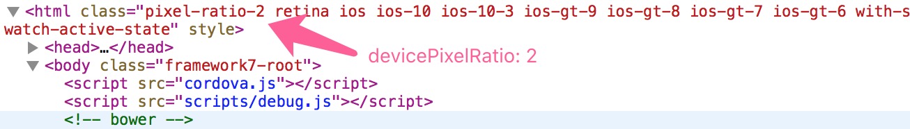
注意到以上通过 CSS 媒体查询获知当前屏幕的 devicePixelRatio,然后针对不同的 devicePixelRatio 进行处理。还有一种另一种方式,通过 JS 在 HTML 节点添加 class 表征不同的 devicePixelRatio,例如在 framework7 框架中, HTML 节点就添加了 devicePixelRatio 有关的 class:

参考链接

Towards A Retina Web
More about devicePixelRatio
Retina屏的移动设备如何实现真正1px的线?